Soft Lights, No Clocks: How Comfort-Branded Online Casinos Are Quietly Stretching Your Sessions

There's a reason you feel more at ease spinning reels on a site wrapped in warm browns, dessert imagery, and soft rounded fonts than you do on some stark, neon-blasted platform that screams "casino." That ease is the product. And if you're playing on a comfort-themed gambling site right now — maybe even one with a name involving chocolate — it's worth asking yourself: how long have I actually been here?
Because that answer might surprise you.
The Architecture of Ease
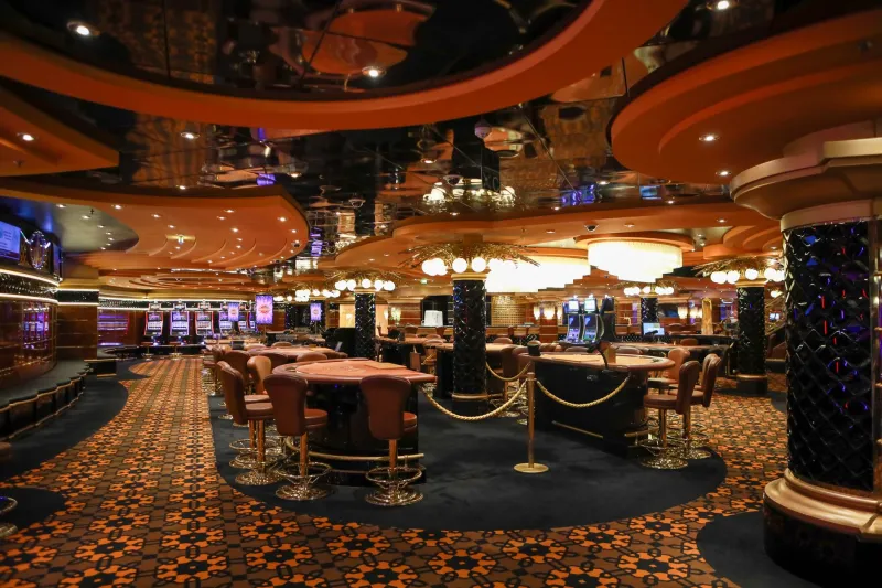
Physical casinos have spent decades perfecting environmental manipulation. No windows. No clocks. Oxygen-rich air, free drinks, and a maze-like floor plan that makes the exit feel like an afterthought. The whole physical space is engineered to make time dissolve.
Online casinos face a different challenge. You're sitting at home. Your phone is right there. The exit is literally one browser tab away. So how do comfort-themed platforms keep you engaged for sessions that stretch far longer than you planned?
They don't fight your comfort zone. They occupy it.
Warm color palettes — think deep cocoa browns, caramel golds, and cream whites — trigger associations with rest, indulgence, and safety. These aren't random aesthetic choices. Color psychology research consistently shows that warmer tones lower perceived urgency and reduce the kind of sharp, alert thinking that might prompt you to check how much you've spent or how long you've been playing. When a site feels like a cozy Sunday afternoon, your brain starts treating it like one.
Friction Removal Is the Real Game
Here's the mechanic that doesn't get talked about enough: comfort-themed sites are exceptionally good at removing friction from continued play.
Friction, in UX design terms, is anything that slows a user down or forces a decision. A jarring color scheme creates friction. A confusing interface creates friction. An aggressive pop-up asking if you want to set a deposit limit? That's friction — and it's friction that might actually save your bankroll.
When a site wraps everything in a warm, familiar aesthetic, the friction evaporates. The "play again" button feels as natural as refilling your coffee. The transition between games feels seamless, almost cozy. There's no visual jolt to snap you out of the flow state. The design actively discourages the kind of mental pause where you might think, wait, have I been here for two hours?
Compare this to a more intense, high-contrast casino design. Those environments, ironically, may be better for your bankroll — not because they're more honest, but because the stimulation keeps your conscious brain more active and alert. Comfort dulls that alertness. That's the paradox.
Time Blindness by Design
One of the most underappreciated tactics in the comfort-casino playbook is the suppression of time awareness. Physical casinos remove clocks from walls. Online platforms have a subtler version of the same trick.
Think about the last time you played on a warmly branded slot site. Was there a visible session timer on the main interface? A clear display of how long you'd been logged in? Probably not front and center. Most platforms bury that information in account menus or settings pages — accessible, technically, but not prominent.
Meanwhile, the game interface itself is designed to be absorbing. Smooth animations, satisfying audio cues, near-miss mechanics that keep the next spin feeling like it matters. Dessert-themed slots are particularly effective here — the imagery is inherently associated with reward and anticipation. Every spin carries a little dopamine echo of "something good is coming," which is the same psychological loop that makes it hard to stop eating chips even when you're not hungry.
Time passes. You don't notice. That's not a bug in the design — it's the feature.
Why Cashing Out Feels Weird
Here's something worth sitting with: on a well-designed comfort-branded platform, cashing out often feels socially awkward, even when you're alone.
That sounds strange, but it's rooted in how these environments frame the experience. When a site positions gambling as a leisure activity — something warm and casual, like browsing Netflix or making a cup of hot cocoa — stopping feels like leaving a good movie early. The experience is presented as ongoing enjoyment, not a financial transaction with real stakes.
This framing subtly repositions the cash-out decision. Instead of "I've reached my limit, I should stop," the internal monologue becomes "why would I leave when I'm having a good time?" The comfort aesthetic has recontextualized the entire session as entertainment rather than gambling, and that mental shift has real financial consequences.
Physical casinos do a version of this too — the resort experience, the free dinner, the show tickets — all of it frames gambling as part of a lifestyle, not a series of financial decisions. Online comfort platforms achieve the same effect with design alone, which is actually more impressive and more insidious.
What You Can Actually Do About It
None of this means you can't enjoy a warmly designed gambling site. It means you need to bring your own friction when the platform isn't providing it.
Set a hard session timer before you start. Use your phone's clock app, not a mental estimate. Decide in advance: 45 minutes, done. When the timer goes off, the session ends — regardless of whether you're up or down.
Write down your starting bankroll. Literally write it down, on paper if you can manage it. The physical act of recording the number creates a mental anchor that the cozy interface is specifically designed to dissolve.
Use responsible gambling tools, even if you don't think you need them. Most licensed US-facing platforms offer deposit limits, session limits, and cooling-off periods. These features create the friction the design removed. Use them preemptively, not reactively.
Treat the cash-out button like a scheduled stop, not an emergency exit. Decide in advance at what point you'll cash out — a profit target, a loss limit, or simply a time marker. Making the decision before the session starts means you're not making it under the influence of two hours of warm ambient design.
The Bottom Line
Comfort-branded casinos — the chocolate-toned, dessert-aesthetic, cozy-corner-of-the-internet type — are genuinely pleasant to use. That's not a criticism; it's an observation about why they're effective. The warmth is real. The enjoyment is real. But so is the engineering underneath it, and so are the extended sessions and the quietly swelling losses that come with them.
The smartest thing you can do as a player is appreciate the craft while refusing to be managed by it. Know that the soft color palette and the seamless game transitions and the absence of a prominent session clock aren't accidents. They're decisions made by designers who understand human psychology better than most players give them credit for.
Play on whatever site you enjoy. Just show up with your own clock, your own limits, and your own exit plan. Because the site definitely isn't building one for you.